
JoyApp

About the project
Fun with Joy!
JoyApp is the app for the most loyal Joyvillagers. Not only it helps you gaining more points than just having the card, but it also gets you gifts to use at JoyVillage! Be part of the league, have fun!
Tools
- Sketch
- Axure RP
- Adobe Illustrator
- Paper
- Pilot V7
What makes it so cool:
- My first real project (which is always incredible)
- It’s a complete and published app
- I gained a good experience regarding what to do and what not to do
Problem
JoyVillage wanted to create an app which customers would use as their digital wallet points.
Solution
We built a gaming digital experience that would make the store experience even better. Not only customers are able to check their points, but they are also challenged to find a specific item and take a picture of it, which they are scanned through image recognition. If they find the right item, they win badges and coupons (yo, it’s free pizza!).
Step 1: Research

- Benchmark
What other people do? What did they succeed with?
I studied several companies – such as Wuntu by Three UK, Chuck E Cheese’s, or Dave & Buster’s -, and I found inspirations about engagement ideas. - Etnography
What do people do when they are at Joyvillage? Do they play together? Do they play alone? What are they looking for?
To find out the real Joyvillager experience, I went there and studied for few hours in different days.The takeouts? People needed to augment their experience. They did not need just a digital card. There was already an app for that.
Step 2: Mapping
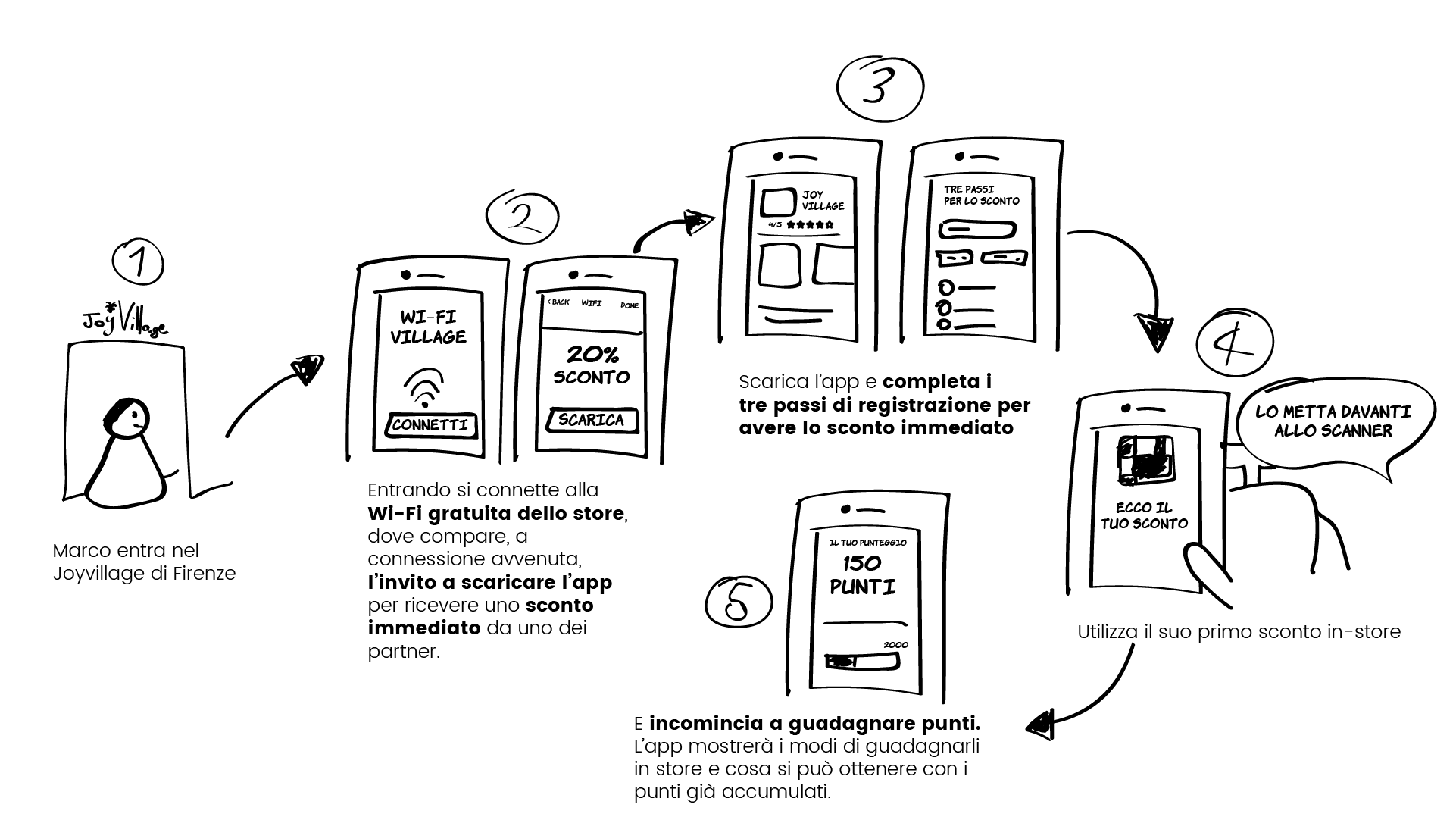
User stories
After all researches done, it was important to map the context of use: when would user find out about the app? What would happen next? When would they use mainly? How would they share it?

Functional requirements
After defining what were the main context in which the user would use the app, I created a list of features needed (anything, really. A profile, a camera, a scanner. Anything that would help mapping what would the app be).
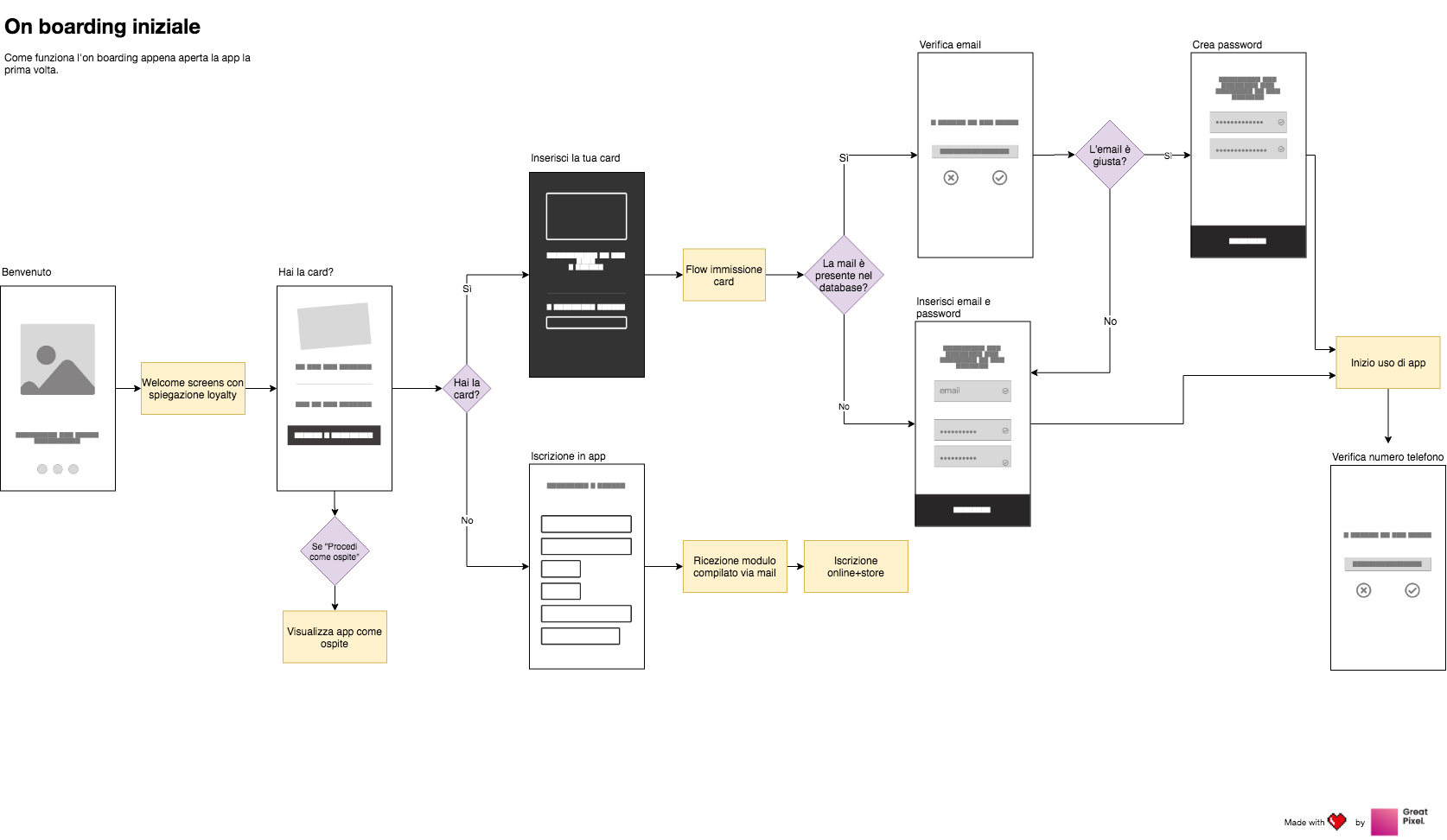
Navigation and flow
Nothing is really mapped out until there is an information architecture behind. I posted-it several different IA until I found the right one I thought it would be useful for the user. In the end, I created a navigation flow with all the pages I would design later on.
Step 3: Wireframes
From LO-FI to MID range, I designed the interfaces to balance info and experience.
Time and budget weren’t enough to do some testing. Hence, I had to do in-house quick testing. It was a bit biased, but it helped a lot when designing the form.

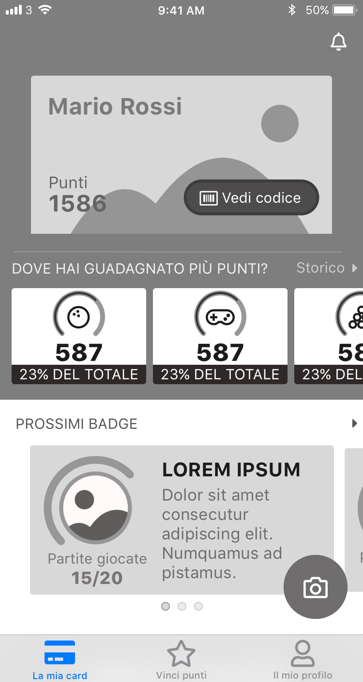
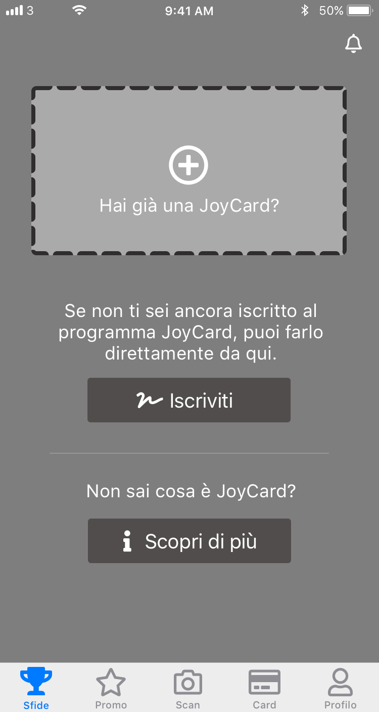
These are just few examples to show you an idea of my process.
There’s actually 140 screens between mobile and desktop, which I’m not allowed to publicly share.
Check it out yourself!


Liked this?
Check out the previous project!
Liked this?
Check out the next project!